If you have used a Mac in the last five years, opened an iOS notification panel, or interacted with almost any modern productivity application, you have seen glassmorphism. You may not have known what it was called. But you recognized it instantly: the frosted-glass surface, the soft blur of content visible through a translucent panel, the sense of depth and layering that makes an interface feel like it exists in physical space rather than on a flat screen.
Glassmorphism is the design language of the current era of digital interfaces. It has moved from an experimental aesthetic choice used by a handful of designers on Dribbble to the default visual vocabulary of operating systems, productivity applications, browser extensions, and consumer software across every major platform. Apple adopted it as the foundation of macOS Big Sur in 2020 and has refined it through every subsequent release. Microsoft incorporated it into Windows 11's Fluent Design system. Google's Material You design language includes its own interpretation of translucent layering.
Understanding what glassmorphism is, why it works psychologically and visually, and why it has become the dominant aesthetic for browser extensions specifically tells you something useful about the current direction of interface design — and why the extensions you use every day increasingly look the way they do.
What Is Glassmorphism? A Precise Definition
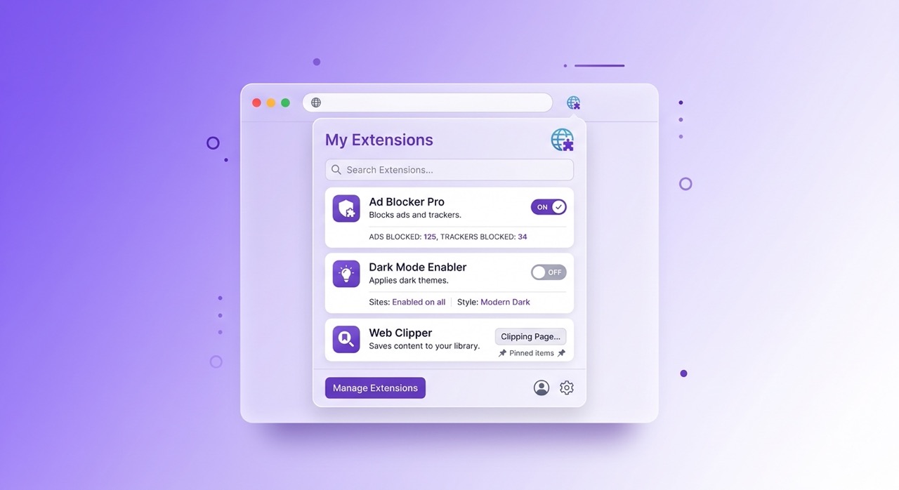
Glassmorphism is a UI design style characterized by four visual properties applied together: background blur, semi-transparency, subtle border definition, and soft shadow depth.
Background blur is the defining property. A glassmorphic element does not have a solid, opaque background. It has a translucent surface through which a blurred version of whatever is behind it remains faintly visible. The blur radius determines how much of the background content is legible through the surface — a low blur radius preserves more background detail, a high blur radius produces a more opaque frosted effect.
Semi-transparency works in combination with the blur. The surface is not fully opaque, which allows the background to show through, and not fully transparent, which would make the interface element invisible. The opacity value — typically between 10% and 40% in well-executed glassmorphic design — determines how much the surface reads as a distinct element versus blending into the background.
Subtle border definition separates the glassmorphic element from its environment. A very thin, semi-transparent white or light border around the element's edges creates the impression of a glass panel catching light at its edges — the visual cue that signals "this is a solid object with thickness" rather than a flat shape floating on a 2D plane.
Soft shadow depth completes the physical metaphor. A gentle, diffused shadow beneath or around the glassmorphic element reinforces the impression that it is hovering above the surface behind it, adding a spatial dimension to what would otherwise be a flat interface.
These four properties together produce the frosted glass effect that gives the style its name. The result is an interface that feels material — like something you could pick up and move — rather than purely digital.
The History: Where Did It Come From?
Glassmorphism's current dominance has clear historical roots, though the path from those roots to the present aesthetic is not a straight line.
The earliest precursor is skeuomorphism — the design style that dominated the iPhone's early years, in which digital interface elements were designed to look like their physical counterparts. A notes application looked like a yellow legal pad. A bookshelf application displayed books with visible spines and wood-grain shelving. The design language communicated function through literal physical metaphor.
Skeuomorphism fell out of favor as users became comfortable enough with digital interfaces to navigate them without the scaffolding of physical metaphor. Apple's iOS 7 in 2013 was the inflection point — a radical redesign toward flat design that stripped away the physical textures and replaced them with clean colors, minimal shadows, and geometric simplicity. Flat design became the dominant aesthetic of the mid-2010s across virtually every major platform.
The limitations of pure flat design became apparent relatively quickly. Flat interfaces are clean but can feel cold, difficult to parse spatially, and visually monotonous. The complete absence of depth cues makes it harder to distinguish interface elements, understand hierarchy, and develop intuition about which elements are interactive.
Glassmorphism emerged as a synthesis — preserving the cleanliness and visual restraint of flat design while reintroducing depth, dimension, and material quality through translucency rather than through the literal physical textures of skeuomorphism. The depth is abstract rather than representational. The material quality is light rather than textured. The effect is modern rather than nostalgic.
Apple's macOS Big Sur in 2020 brought glassmorphism into the mainstream. The sidebar of Finder, the notification center, the Control Center — all adopted the translucent, blurred-background aesthetic that has since become inseparable from the macOS visual identity. iOS followed with its own implementation. Windows 11 brought acrylic material — Microsoft's version of the same aesthetic — to Windows. The operating system implementations gave the style mass exposure and effectively established it as the visual baseline for modern interface design.
Why Designers Love It: The Psychological and Visual Reasons
Glassmorphism's adoption is not primarily a matter of fashion. It works for specific reasons rooted in visual perception, cognitive psychology, and the practical requirements of modern interfaces.
Depth without clutter. Modern interfaces need to communicate hierarchy — which elements are in front, which are behind, which are interactive, which are contextual. Flat design communicates hierarchy through color, size, and positioning alone, which works but requires careful execution and can feel arbitrary. Glassmorphism communicates hierarchy through physical metaphor: elements that appear to be in front of others are visually in front of others, with the blur and shadow reinforcing the spatial relationship. Users understand spatial relationships intuitively. They do not need to learn them.
Visual separation without visual weight. A glassmorphic panel sits on top of the content behind it without creating a heavy, opaque block that occludes the underlying context. For applications where the context behind the panel matters — and browser extensions are a perfect example of this — a solid opaque overlay destroys the context that makes the overlay useful. A glassmorphic panel maintains the context while creating clear visual separation. You know you are looking at the extension's interface and you know the web page is still there.
Adaptability to varied backgrounds. A solid-color interface element looks designed for the specific background it was tested against. On a different background, it may clash, disappear, or create visual noise. A glassmorphic element adapts to any background because it takes on the colors and tones of whatever is behind it. The blur and semi-transparency mean the element always looks designed for its current context, regardless of what that context is.
Premium association. Glass, in physical materials, is associated with quality, precision, and premium objects. Crystal, high-end watches, architectural glass — the material carries connotations that translate into digital design. An interface that looks like glass feels more considered, more refined, and more premium than one that does not. For consumer applications and browser extensions where trust and perceived quality matter, this association is not trivial.
Glassmorphism in Browser Extensions Specifically
Browser extensions have particular design constraints that make glassmorphism especially well-suited to the format.
A browser extension interface appears on top of an existing web page. The web page is not a controlled background — it is whatever the user happens to be visiting when they open the extension. It might be a mostly-white news site, a dark-mode social platform, a colorful e-commerce page, or a video player with a dark interface. The extension's design has to work against all of these backgrounds, not just the one it was designed on.
A solid-color extension panel that looks clean against a white background looks jarring against a dark background. An opaque white panel on YouTube's dark interface creates an aggressive contrast that feels like an error rather than a feature. An opaque dark panel on a light page creates the same problem in reverse.
Glassmorphism solves this problem by design. A translucent, blurred panel takes on characteristics from whatever is behind it — becoming slightly darker on dark backgrounds, slightly lighter on light backgrounds, inheriting tones from the underlying page. The extension looks native to wherever it appears because it partially reflects its environment.
This is precisely why AI Summary uses a glassmorphic interface. The extension appears within YouTube's interface — which can be either light or dark depending on the user's settings — and needs to feel like a natural part of that interface rather than a foreign object inserted into it. The glassmorphic design adapts to both YouTube themes automatically, without requiring separate light and dark mode implementations that maintain two visual identities rather than one unified one.
The result is an extension that feels, as much as a third-party extension can, like it was designed by the same team that designed the platform it lives in.
How to Implement It: Basic CSS for Developers
For developers who want to implement glassmorphism in their own projects, the core effect requires surprisingly few lines of CSS. The browser support for the relevant properties is now essentially universal across modern browsers.
The fundamental implementation:
.glass-panel {
  background: rgba(255, 255, 255, 0.15);
  backdrop-filter: blur(12px);
  -webkit-backdrop-filter: blur(12px);
  border: 1px solid rgba(255, 255, 255, 0.25);
  border-radius: 12px;
  box-shadow: 0 8px 32px rgba(0, 0, 0, 0.12);
}
The backdrop-filter: blur() property is the technical foundation of the effect — it applies a blur to the content behind the element rather than to the element itself. The background: rgba() with a low alpha value creates the semi-transparency. The border with a semi-transparent white color creates the edge definition. The box-shadow adds the depth.
Several practical considerations affect implementation quality.
The background must have content for the blur to act on. Glassmorphism only works visually when the element is layered over a background that has variation — an image, a gradient, other interface elements, or the web page content behind an extension panel. A glassmorphic element on a flat solid-color background produces no blur effect because there is nothing to blur.
Performance varies by browser and device. The backdrop-filter property is computationally more expensive than standard background rendering. On lower-powered devices, applying many simultaneous glassmorphic elements can affect performance. The solution is to use the effect selectively — primary panels and cards rather than every interface element — and to test on a range of hardware.
Color choices interact with the translucency. The perceived color of a glassmorphic element is a combination of the element's own background color (at low opacity) and the colors behind it. This means the element's appearance varies across contexts in ways that a solid-color element does not. Design with this variability intentionally rather than treating the element as if it will always appear over the background used in development.
Dark and light glassmorphism require different base opacities. Light glassmorphism — white-tinted translucency on a dark or colorful background — uses low white opacity (10% to 20%). Dark glassmorphism — dark-tinted translucency on a light background — uses dark colors at similarly low opacity. The principles are the same but the implementation values differ.
When NOT to Use Glassmorphism
Understanding the cases where glassmorphism is inappropriate is as important as understanding where it works.
High-information density interfaces. When an interface needs to display a large amount of text, data, or controls with maximum legibility, the semi-transparency and variable background of glassmorphism can reduce readability compared to a solid, controlled background. Data dashboards, code editors, and text-heavy document interfaces generally work better with solid backgrounds that provide consistent contrast.
Accessibility-sensitive contexts. The reduced contrast between text and a translucent background can create readability issues for users with visual impairments. WCAG contrast ratio requirements are more difficult to guarantee with glassmorphic backgrounds because the effective background color varies. Interfaces with strict accessibility requirements need careful testing, and in some contexts should provide a non-glassmorphic alternative.
Low-powered devices or performance-critical applications. The backdrop-filter property carries a performance cost. Real-time applications, mobile web experiences on low-end devices, and any interface where rendering performance is critical should use the effect sparingly or not at all.
When the background is not visually interesting. Glassmorphism works because of what shows through the glass. If the background is a flat, unvarying color, the translucency adds no visual value and the blur produces nothing. The aesthetic requires a visually interesting environment to act on — which is why it works so well for browser extensions (which appear over varied web page content) and less well for standalone applications with plain backgrounds.
Examples in the Wild: Where You See It in 2025
The list of products and interfaces using glassmorphism in 2025 is easier to enumerate by exception than by example. The style has become so widespread that it is effectively the default aesthetic for new consumer software and operating system components.
macOS Sonoma and Ventura use it throughout: sidebars, toolbars, notification banners, the menu bar, Control Center panels, and the dock background. iOS and iPadOS use it in the notification center, the lock screen, the dynamic island interactions, and the majority of system overlays. Windows 11 uses it in the taskbar, Start menu, settings panels, and many system applications.
In the application layer, Notion uses it for command palettes and floating panels. Linear uses it for its command interface. Figma uses it for floating tool options. Arc Browser uses it throughout its interface. The trend is consistent: tools designed for knowledge workers and developers — the audience most likely to appreciate refined visual design — have adopted the aesthetic most aggressively.
In browser extensions specifically, the aesthetic has become a quality signal. Extensions with glassmorphic interfaces communicate that the developer cares about design and has invested in the visual experience. Extensions with dated flat or skeuomorphic interfaces communicate the opposite — regardless of how functional the underlying tool is.
AI Summary's glassmorphic panel — which adapts between YouTube's light and dark themes while maintaining visual consistency with the platform — is an example of the aesthetic deployed for a specific practical reason rather than as a decorative choice. The frosted-glass panel feels native to YouTube because it partially reflects YouTube's interface, regardless of which theme the user has set.
Frequently Asked Questions
Is glassmorphism the same as neumorphism? No. Neumorphism is a distinct style that uses subtle inner shadows and outer shadows on elements with backgrounds matching the page background to create a soft, extruded appearance — as if elements are molded from the background material. Glassmorphism uses transparency and blur to create a layered, floating appearance. Both are post-flat design aesthetics that reintroduce depth, but through completely different mechanisms. Neumorphism has significant accessibility limitations and has not achieved widespread adoption. Glassmorphism has become mainstream.
Will glassmorphism fall out of fashion as flat design did? Design trends cycle, and glassmorphism will eventually be superseded by something else. The question is when and by what. Flat design's rise and fall happened over approximately seven years. Glassmorphism has been the dominant aesthetic since approximately 2020, has been adopted at the operating system level by all major platforms, and shows no signs of immediate replacement. The most likely evolution is gradual refinement — increased subtlety, better accessibility compliance, and integration with new display technologies — rather than sudden displacement.
Does glassmorphism work on mobile interfaces? Yes, though the performance considerations are more significant on mobile hardware. iOS and Android both support the backdrop-filter CSS property in their web rendering engines, and native mobile frameworks on both platforms provide glassmorphism components. The implementation requires more careful performance management than desktop, but the aesthetic works visually on mobile screens.
Why do some glassmorphic interfaces look cheap while others look premium? The difference is usually in the detail: the precision of the blur radius, the restraint in the opacity level, the quality of the border definition, and the consistency of the shadow. Poorly implemented glassmorphism uses excessive opacity (the element looks nearly solid), insufficient blur (the background is too legible), or missing border definition (the element has no edge). Premium glassmorphism uses these properties precisely — just enough translucency to convey the glass quality, just enough blur to create the frosted effect without obscuring the background entirely, and a border thin enough to catch the light without being visually prominent.
Can I use glassmorphism in a browser extension I am developing? Yes. The CSS implementation described earlier in this article works in Chrome extension popup windows and content scripts. The main consideration is testing across the range of backgrounds your extension will appear on — dark pages, light pages, image-heavy pages, and video players. A well-tuned glassmorphic implementation will look intentional across all of them.
Conclusion
Glassmorphism is not a trend that happened to become popular. It is a design language that solved a specific set of problems — the need for depth without clutter, adaptability across varied backgrounds, visual hierarchy without visual weight, and premium aesthetic quality — at a moment when interfaces had become flatter and more uniform than usability and quality communication required.
Its adoption at the operating system level by Apple, Microsoft, and Google reflects something more durable than trend-following. It reflects the recognition that interfaces need to feel material and spatially coherent in ways that pure flat design does not provide, and that glassmorphism provides those qualities without reverting to the literal physical textures of skeuomorphism.
For browser extensions specifically, glassmorphism is close to the optimal design choice: it adapts to any web page background, communicates quality, creates clear spatial separation without occluding context, and feels native to the platforms it appears on rather than foreign. These are not aesthetic preferences. They are functional requirements, and glassmorphism meets them.
The frosted-glass panel you see in your browser extension today is the product of five years of convergent evolution across the world's major software platforms — not a coincidence, but the current answer to a design problem that has been worked on collectively and seriously.
AI Summary's glassmorphic interface adapts seamlessly to both YouTube light and dark themes — see it in action by installing the free Chrome extension at aisummary.site.
Previously: The Ultimate Guide to YouTube Productivity: Watch Less, Learn More ← · Next read: How to Use AI to Get More Out of YouTube Without Watching Every Second →
Related: Best YouTube Summarizer Tools in 2025: Tested & Ranked · 5 Chrome Extensions That Make YouTube Actually Useful for Learning